7 min læsning

Don't care about your data and message? Go cook up a pie - your audience will adore you and your work! Or will they - and should they? In todays post we will serve you some pie, discuss pros and cons of this chart type, and offer you a few tips on how to obtain a healthier diet.
The pie chart remains a surprisingly popular ingredient in the media and various sorts of business reports and dashboards. Do a quick Google search on 'Chart' and the menu will look something like this:

Obviously, the most prevalent chart is the pie chart. Your data is served - enjoy! The fascination with pie charts is not exactly hard to understand. After all, they are pleasantly round, colorful, decorative and entertaining - especially when they are spiced up with 3D and topped with icing in sexy colors. All in good accordance with the name, I suppose. Who would not prefer to serve boring numbers in such a way?
Often, this is the primary argument I hear when asking people why they insist on using a pie chart to represent (almost any kind of) data: If we don't dress up our numbers, no one cares to look at them. Scarily, entertainment takes precedence over information. Clearly, if our purpose as data communicators is to spread and enhance knowledge, we must strike a better balance between the need to entertain and the need to inform.
But surely, the pie chart must have some merits?
It does! The pie chart excels in showing a part-to-whole relationship. Like how the sales in different regions contribute to the overall sales. The circle is probably the most intutive graphic representation of a united entity with all its constituent parts inside. Each slice clearly belongs to and contribute to the whole pie. Very intuitive - makes perfect sense!
At the same time, however, the pie chart is the pet peeve of most professionals working with data visualization. Let me tell you why. When it comes to displaying quantitative information - the pie simply fails because it relies so heavily on areas and angles. It particularly flunks the usability test if it is meant to be used for comparing values. Take a look at the sales in the four regions depicted below:
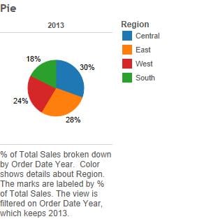
To properly assess the size of a slice, we need to know its angle. Most people are comfortable with neat angles of 45, 90 and 180 degrees - but rest asured: real data are going to show all the ugly, awkward angles that cannot be read as easily. Next, in order to compare and rank the size of the slices, we look at area. Comparing the size of two areas to tell which one is bigger is also very hard. Luckily, we have numbers in the chart.
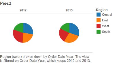
Can your chart stand its own ground - or does it need a lot of support? A good test of whether a chart is self-sufficient and communicates well, is to simply remove the data labels. Now, can you tell the size of the slices? Which region is bigger in 2013: Central or East? I am not even asking you to make comparisons between the two years - I am not that cruel.
OK - let's put the labels back on.

The fact that the pie chart is not very self-sufficient means that you have to do a lot of labeling which ends up taking up a lot of room on your presentation canvas.
By the way, how did you find Central and East? You probably checked back and forth between the pie and the legend to the right. Annoying, when you have to flicker your eyes like that is it not? Multiple small distractions that are caused by the fact that there is no easy way of labeling the series in a pie chart. Luckily there were only four series, so it is possible to memorize the colors after a little while. However, the more slices you add, the worse it will get.
So as a harsh rule of thumb, for a pie chart to work, you want to stick to 2 or fewer categories. Or drop it altogether. At least consider alternatives.
Alternatives to the pie chart
Fortunately, other types of charts can quickly come to the rescue.
The bar chart is the primary alternative to the pie chart. 9 out of 10 times this chart will communicate your data better. No problems caused by area and angles here! Bar charts use length and position to communicate the quantities, and these visual features are extremely easy for us to take in.
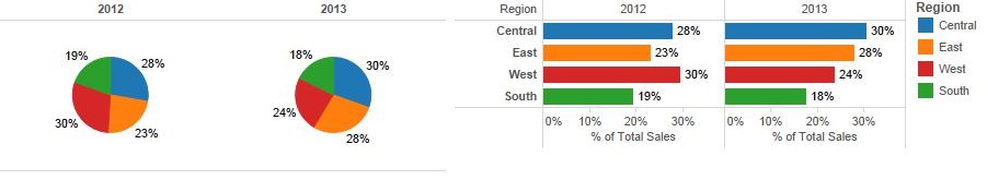
In the above example, notice how much faster it is to decipher the information because the lengths clearly depict size and are rankable and comparable. In reality, we don't even need the colors in the bar chart at all, so there is no need for a color legend, and the series are easily labeled to the left of the bars. I have only kept the colors in order to better compare the two chart types.
To maintain the part-to-whole relationship using bars, we can stack our series like in this stacked bar chart. Now, the composition of total sales shows, as regional sales for each year sums to 100%.
![]()
Alas, it can be difficult to compare across years when stacking bars, which we also discussed in this post. Apart from the series with fixed baselines at the ends (blue and green), it is a little hard to see differences between the years. This problem can be avoided if you give each series its own panel - like this:
![]()
When you think of it, the bar chart really deserves its own post, so I will probably do one later and not expand further on the subject here.
The treemap is an alternative way of displaying the part-to-whole relationship. It is primarily used for very large sets of hierarchically ordered data. As such, the few data points used in this example would be rather trivial for a treemap, which is why I added some product categories to spice up the example below.
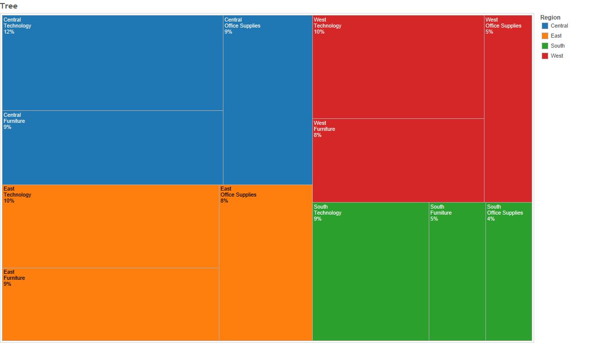
The treemap still uses area sizes to communicate the quantities, but rectangles are far easier to quantify and compare than pie slices. Simply because you have the lengths, i.e. height and width of each rectangle. Still, comparisons are not as easy to do with any accuracy as they were in the bar charts. On the other hand, the treemap renders a nice sense of how the total sales are composed of product category sales across the regions, and it can contain a lot of series and hierarchical information. It ranks the entities so we have largest region first, and then within it the product categories in descending order.
So alternatives to pies exist - no reason not to provide a better, more digestible menu. After all, that is what keeps customers coming back.
Don't be a pie charter - respect your data, your message and your audience!
Please don't get me wrong - at Inspari, we love pies - for dessert. We also love charts and visualizations that work for our data and users. We work with BI tools with the purpose of conveying information efficiently to our users, so they can focus their energy on making the appropriate data driven decisions for their business. Why should your user need to spend precious time scanning, memorizing, ranking and comparing values in your visualization in order to get to the message? Is that not the sort of insights and affordances that you ought to build into your visual design to begin with? We believe it is, and that is why we respectfully put pie at the bottom of the menu.

Do you have any questions?
Please reach out to info@inspari.dk or +45 70 24 56 55 if you have any questions. We are looking forward to hearing from you.
Relaterede Posts
Enhancing the pattern by keeping text in check
Text is an indispensable helper when we make data visualizations, but we need to be careful not to...
Seattle Seahawks use Azure to provide insights into the rehab process
Do more and keep winning just like the Seahawks with intelligent insights from #Azure.
This week,...